Blog Archives
Iconic
Posted by sinpolaris
Whoever is responsible for this logo is a creative genius.
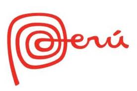
The country of Peru has created its own marketing logo. Seen on clothing and even the national currency, it goes by the name “Marca Peru” and it looks a little something like this…
What I like about the logo is that it is clean (read: simple, not complex) and it imparts the information the creators want to convey (read: PERU!).
I have been here over a year and a half and have seen this logo countless times however it was not until recently that I discovered that Marca Peru is also used to convey two concepts about Peru.
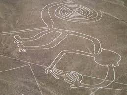
The first idea is the deep history that this country contains. The lines that comprise “Peru” are similar to the famous Nazca lines. Specifically, the concentric circles of the “P” reflect the “Monkey” figure from Nazca. Take a look…
The designers of this logo have also managed to convey the future that is Peru. The concentric circles of the “P” are meant to represent the “@” that comprises all email addresses. This use of the “at sign” is designed to show that Peru embraces technology.
(Fun Language Trivia Fact: The “@” symbol, which is called the “at sign” in English, is called “arroba” in Spanish.)
So, Peru is therefore not only all about its rich roots (i.e., the cultures of Moche, Inca, Nazca, etc.) but is also a forward-looking technology-embracing land.
All of that from a logo.
Proof that the citizens of Peru know a little something about technology, I hereby offer this minor sample where the locals put their own spin on an on-line craze.
Ladies and gentlemen, a version of the Harlem Shake as done in the Lima suburb of La Molina as created by Publimetro, a free daily newspaper.
Other versions can be found here (you can tell they are in Peru because of the Inca Kola bottle on the table) and here and here (the box that the boy is thumping in the middle is a Peruvian percussion instrument called a cajon) also.

